Forest County Brand
Client
Forest County Recovery Center
Services
Graphic Design
Skills
Graphic Design, Illustrator


Client
Corporate identity and brand work for Forest County Recovery Center
The Results
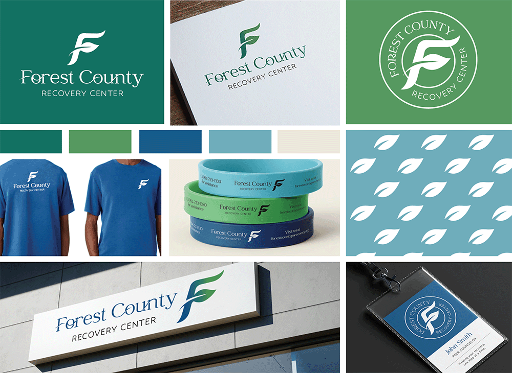
- I didn't want to follow the pattern that a lot of recovery centers fall into, and that's focusing on elements like hands, hearts, crosses or pathways.
- I created a visual language that aligns with what a recovery center needs to communicate: hope, stability, growth, professionalism, and human care.
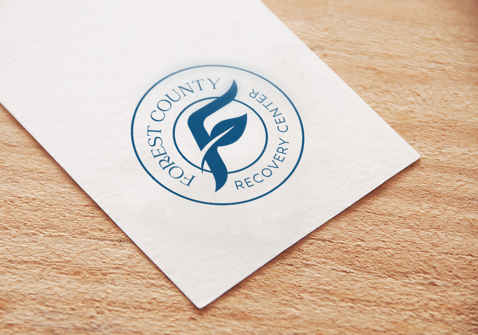
- Incorporating the leaf shape with the uppercase F connected to the Forest County community but also helps show growth, new beginnings, and life
- The client wanted a color palette that included red based on personal preference, but I established that this palette evokes growth, health, and trust when red can result in the opposite feelings
- I designed the Forest County font to feel established and respectable and not feel corporate or institutional
- The F/leaf shape works in a stand-alone format and helped create the leaf pattern used on their website
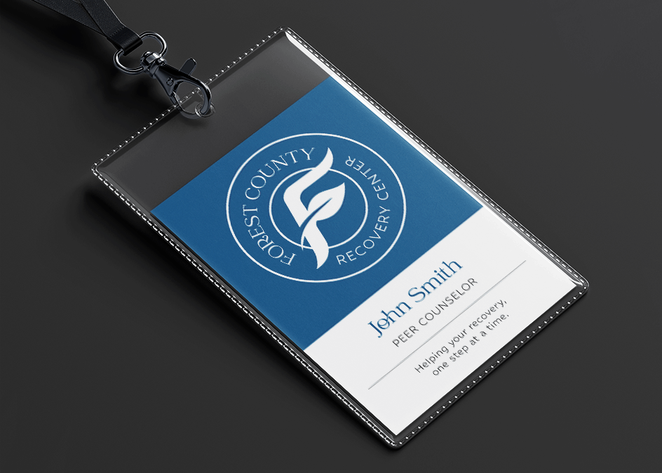
- The secondary seal design gives the client choices that extend beyond stationary or their website.
- I wanted the overall approach to communicate renewal and hope without becoming sentimental, and professionalism without becoming institutional.